Friday 27 February 2015

Fantastic Voyage - Style Inspiration Ideas


I've begun to look for the style I will use for the animation on slime mold. In this first post about the style I have mostly looked at games which have distinct qualities that could lend themselves to an animtion of this type. The images aboive are as follows from left to right; Botanicula, Worms, Limbo, Osmos, Vessel, World of Goo, Little Inferno and finally Solar 2.

While some of these games have styles that I think could help me, I definitely feel that much more digging will be required before I strike metaphorical gold. Especially in other areas besaides game art styles. So far though I think that working with ink could be a possibility so I will try to look more into it to see if it could help create what I want in my animation. To me ink seems to lend itself to the qualities of slime mold, and it could be expecially effective in graphically representing its key stages.

-On a side note, any recommendations towards certain art or media that you think could help is welcome.

Sound Designer Profile - Ben Burtt


Animation with Adobe Flash - Tweening

Classic Tweening 1

Classic Tweening 2

Motion Tweening 1

Motion Tweening 2


Adobe Illustrator Lesson - Creating the 'Achievement Hunter' Logo

In the lesson today we recreated a logo of our choice by importing it as a template, then working over the top of it with various illustrator tools to create our new version.

 
Here is my finished result.

Wednesday 25 February 2015

Life Drawing - 25/02/15

I've taken Phil's advice for this set and altered the levels in Photoshop to make the drawings more visible.


Fantastic Voyage - Life cycle of Slime Mold


After looking into and considering all four life cycles, the Slime Mold is definitely the one I was most drawn to after further research into the stages of it. I have looked at multiple diagrams which show the key stages in its life cycle, the ones below are diagrams that I found particularly interesting or useful in breaking the cycle down.


One another note, apparently my old buddy and 'What If Metropolis' work colleague Ernst Haeckel has created a print specifically of Slime Mold. This could be a good source for some inspiration.


While my ideas are only starting to flow for this project, one thing I would like to consider is narrating from the perspective of the slime mold itself. It is something I haven't seen in the previous animations and it could make the animation I make more interesting. It is of course not certain yet but it is something to think about as I move forwards.

Maya Tutorial - Arm Anticipation and Follow-Through


Monday 23 February 2015

Maya Tutorial - Walk Cycles Part 1: Mechanics


Photoshop session - 23/02/15

 Environment Studies
 
Portrait Study
 
Complex colour Study
 
 
Overall I really enjoyed this session, especially as I feel that these fundamentals are things I really need to get the hang of to progress. Looking forward to the next session. :)

Thursday 19 February 2015

From Script to Screen - Art Of Presentation


FSTS DVD Cover


Final Environment concept


This is my final environment concept. I decided to keep the polygonal style that I had achieved with earlier pieces and I'm quite happy with the result here.

Animatic with Pre-vis


My animatic with the pre-vis scene replacing my animatic scene for the totem falling.

Pre vis scene

 
This is a pre-vis scene of the totem falling in the 3rd act. This was the only scene that could not be properly shown in the animatic so this is the only one I will do. It was a lot more complicated than I first realized and I needed to get a lot of help with it, but in the end I'm pleased with the outcome of this scene.

Completed Character Designs

 
These are the final designs for my two chieftain characters. Overall I am quite pleased with the turnout but do let me know if you spot something that bothers you (small tweaks can still be made!).

Wednesday 18 February 2015

Animatic Draft 2 (with sounds)

I have added sounds for the tinkering that chieftain B does when he builds his pogo-stick. I have also added in a sound for the totem falling. I used three sounds from freesound.org which I will link below.

https://www.freesound.org/people/ianoboe/sounds/150203/
falling gumtree

https://www.freesound.org/people/Dvideoguy/sounds/207782/
hammering

https://www.freesound.org/people/paulw2k/sounds/198360/
hand sawing

Tuesday 17 February 2015

Character design progress

 
I have coloured Chieftain A and will be colouring chieftain B next. Overall the colour scheme seems to be working. With the other chieftain I plan to use more varied and bright colours like green and blue, particularly in his headdress.

Monday 16 February 2015

Film Review - The Birds (Alfred Hitchcock, 1963)


Fig 1. The Birds Poster

'The Birds' is a surprisingly deep film considering the plotline consists of nothing more than a slowly escalating rate of bird attacks. All of which happen in the small peaceful town Bodega Bay. While its plot is deceivingly simple, what lurks behind it is a focus on the relationships between Mitch, his mother Lydia and the protagonist Melanie. Lydia is quite openly the over-protective mother and conversations that happen between her and Melanie are subtly awkward. Lydia makes it very clear throughout that she dislikes her.

Xan Brooks states in his review ''Alternatively, they might be viewed as an eruption of rage. The film's first act, after all, is an uncomfortable buildup of tension (both sexual and social), an ongoing joust of loaded glances and teasing evasions.'' (Brooks, 2012). It could certainly be said that the build-up of tension in the first act not only helps to build up the story, but also the overall mood. It is in many ways, one of rage and violence. Most notably in any of the bird attack scenes and also in some of the heated arguments seen between characters in the film. Most of the interactions between Melanie and Lydia are built on a thick layer of distrust, and these create some of the most tense moments in the film when you exclude the bird scenes. 

In his review of The Birds, Alastair Sooke states ''The bird-attack sequences are tremendously complex (the movie contains more than 370 trick shots), and the absence of a score renders the horror more immediate: Hitch's long-time composer Bernard Herrmann fashioned an eerie soundtrack from caws, strident screeches and rustling wings.'' (Sooke, 2015). One of the biggest visual strengths in this film are its birds. The fast-paced sequences where gulls and crows peck, claw and scratch at unsuspecting townsfolk are arguably some of the most terrifying and visually stunning pieces of film in any Hitchcock film (See Fig 2). Birds should not be scary, they are pets and pests. However, with fast-paced clips and brilliantly chilling soundtracks, Hitchcock manages to pull birds out of the beautiful and innocent and into the nightmarish and malicious.


Fig 2. Bird Attack.

Bosley Crowther states in his review in The New York Times ''Whether Mr. Hitchcock intended this picture of how a plague of birds almost ruins a peaceful community to be symbolic of how the world might Le destroyed (or perilously menaced) by a sudden disorder of future's machinery is not apparent in the picture. Nor is it made readily clear whether he meant the birds to represent the classical Furies that were supposed to pursue the wicked on this earth.'' (Crowther, 1963). The back-story in the film is very ominous, there is no clear reason given to the viewer why the bird attacks are happening. In terms of story, nothing is solid, there are no reasons on the surface for many of the events in the film, only metaphors and theories buried deep within the surface of dialogue, setting and character. The ending to the film is fitting for the already confusing plot-line, the main characters who were barricaded in their home get in a car and drive down the road, all the while being watched closely by the thousands of birds perched on and around the house (See Fig 3). Overall, the film is a true thriller and at least to the casual viewer, not much more.


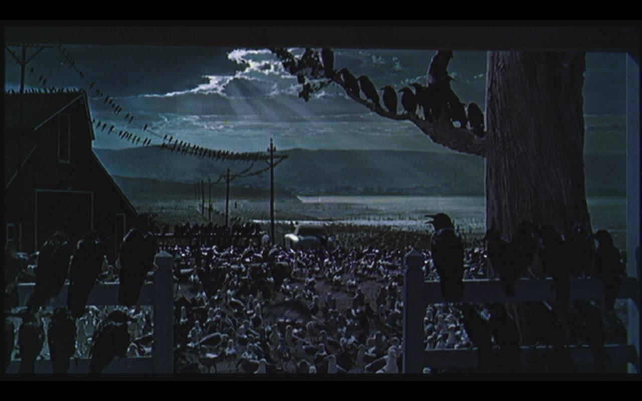
Fig 3. The Birds Ending.

Illustration List

Hitchcock, A (1963) Figure 1. The birds Poster. http://media.zenfs.com/en_US/News/US-AFPRelax/birds_xlg.0503d093428.original.jpg (Accessed on 03/02/15)

Hitchcock, A (1963) Figure 2. Bird Attack. https://blogger.googleusercontent.com/img/b/R29vZ2xl/AVvXsEjut3Qt-A6T4HPAk7oSCe0zdZig6QwXyNPIrK_CYeqUKN3BJuZwltca9C_FJybvrrTp5Iqx8mmBnnTmQl57NnkhqUIBJHJnHzpSJKIT_gCogf4WMXzLvOe-R2O-PE7Qrle9teJoyvFzKpQ/s1600/1963+Tippi+Hedren+The+Birds.JPG (Accessed on 16/02/15)

Hitchcock, A (1963) Figure 3. The Birds Ending. http://www.jasonbovberg.com/wp-content/uploads/2013/06/Birds-7.jpg (Accessed on 16/02/15)

Bibliography

Brooks, X (2012) http://www.theguardian.com/film/filmblog/2012/jul/31/my-favourite-hitchcock-the-birds (Accessed on 16/02/15)

Crowther, B (1963) http://www.nytimes.com/movie/review?res=9D05E7D9143CEF3BBC4953DFB2668388679EDE (ACCessed on 16/02/15)

Sooke, A (2015) http://www.telegraph.co.uk/culture/film/filmreviews/11334674/The-Birds-review-disturbing.html (Accessed on 16/02/15)

Animatic Draft 1 (Without Audio)


Storyboard Shot Changes


After these small changes to current shots and one addition (3.13b), I'm confident to take this forward to the animatic.

Monday 9 February 2015

Friday 6 February 2015

More Refined Chieftain Thumbnails (Feedback Appreciated)

I feel that 6 (chieftain b) and 7 (chieftain a) are quite strong and are very close to what I want in these characters. Let me know what you think!

Further Chieftain A (brawn) thumbnails

Some of these feel like dead ends in terms of development, but I feel like I may be getting closer to what I want from chieftain A.

Like For Like Storyboard Simple Animatic


More Chieftain Thumbnails

After Phil's comments from the OGR I am continuing to design my chieftain, but thinking more about stereotyping, making it cartoonish/exaggerated and polar opposites between the two chieftains.

Thursday 5 February 2015

Life Drawing - 04/02/15


Colour Chieftain Designs (Rough)

1 (chieftain 1, left) (chieftain 2, right)

2 (chieftain 1)

3 (chieftain 2)

4 (chieftain 2)

Here are some rough designs for my two chieftains, I've started to use colour in some. I have also experimented with larger brush strokes which could be something to follow (especially with chieftain 1).