Tuesday 16 December 2014

Maya Winter Submission

1)      Intro to Autodesk Maya:

a         a  )      Modelling (NURBS and Polygon)
http://jackmwhite.blogspot.co.uk/2014/09/1st-maya-tutorial.html

b         b  )      Character Part 1: Modelling
http://jackmwhite.blogspot.co.uk/2014/10/character-tutorial-1-fixed.html

c          c )      Common Shaders
http://jackmwhite.blogspot.co.uk/2014/10/texturing-part-1-common-shaders-tutorial.html

d          d )      UV Maps
http://jackmwhite.blogspot.co.uk/2014/10/uv-maps-maya-tutorial.html

e          e )      Character Part2: Texturing and Shaders
http://jackmwhite.blogspot.co.uk/2014/10/character-and-eraser-texturing-maya.html

f          f )       Lights and Shadows
http://jackmwhite.blogspot.co.uk/2014/11/lighting-and-rendering-maya-tutorial.html

g         g )      Character Part3: Lighting and Rendering
http://jackmwhite.blogspot.co.uk/2014/11/maya-tutorial-character-lighting.html

2)      Modelling 1: Digital Sets

a          a)      Modelling
http://jackmwhite.blogspot.co.uk/2014/10/old-alley-modelling-tutorial.html

b          b)      UV Layout and Texturing Preparation
http://jackmwhite.blogspot.co.uk/2014/10/old-alley-uv-mapping-maya-tutorial.html

c          c)      Lighting
http://jackmwhite.blogspot.co.uk/2014/11/maya-tutorial-alley-scene-lighting.html

d          d)      Colour Maps
http://jackmwhite.blogspot.co.uk/2014/11/maya-tutorial-alley-scene-colour-maps.html

e          e)      Bump and Specular Maps
(DIDN'T DOCUMENT SEPARATELY, SEE FINAL RENDER)

f          f)       Dirt Maps and Final Render
http://jackmwhite.blogspot.co.uk/2014/11/maya-tutorial-alley-scene-final-render.html

3)      Lighting and Rendering1: Intro to Lighting

a          a)      Exterior Lighting: Midday
http://jackmwhite.blogspot.co.uk/2014/11/maya-tutorial-whimsy-house-midday.html

b          b)      Exterior Lighting: Sunset
http://jackmwhite.blogspot.co.uk/2014/11/maya-tutorial-whimsy-house-sunset.html

c          c)      Exterior Lighting: Romantic
http://jackmwhite.blogspot.co.uk/2014/11/maya-tutorial-whimsy-house-romantic.html

d          d)      Exterior Lighting: Night
http://jackmwhite.blogspot.co.uk/2014/12/maya-tutorial-whimsy-house-night.html

4)      Visual FX: Visual Effects 2

a         a)      Render Layers: Software
http://jackmwhite.blogspot.co.uk/2014/12/maya-tutorial-render-layers-1-software.html


b         b)      Depth of Field
http://jackmwhite.blogspot.co.uk/2014/12/maya-tutorial-render-layers-2-depth-of.html

Friday 12 December 2014

Film Review - Only God Forgives (Nicholas Winding Refn, 2013)

Fig 1. Only God Forgives Poster

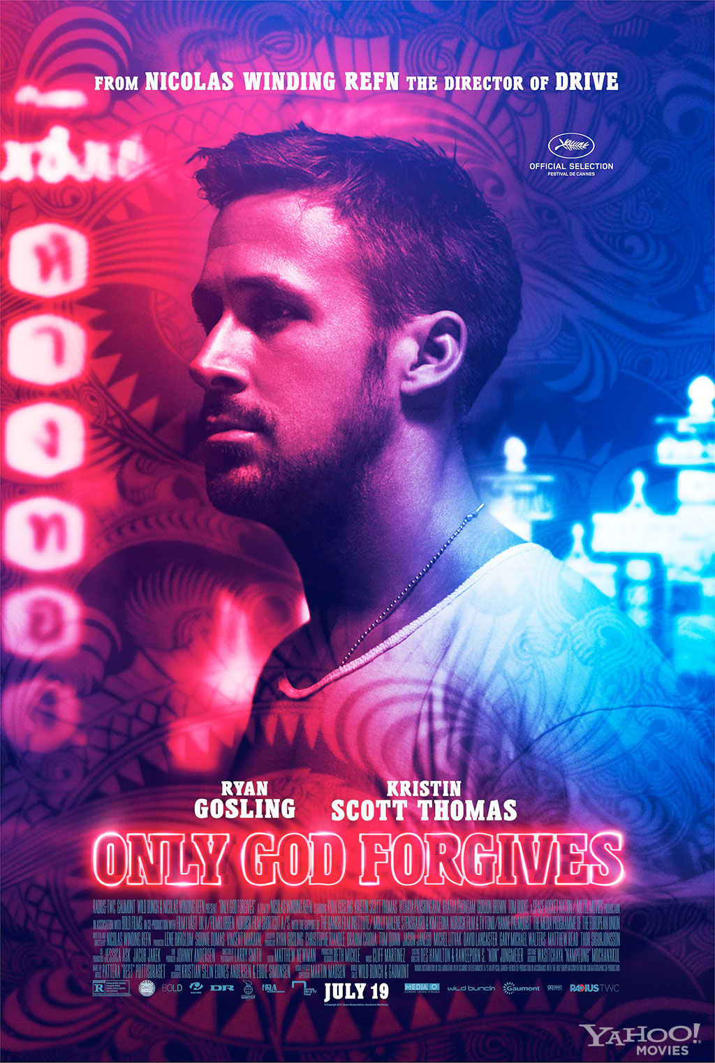
 Only God Forgives is a film about a man named Julian, and the ordeal he goes through after his younger brother is beaten to death after raping an under-age prostitute. After this, the plot becomes a case of events spiralling out of control with Julian at the centre. At the opposite end of the strange set of moments that make up the film, is a police lieutenant named Chang. Throughout the story he is seen as an illusive angel, dealing out punishment and mercy with his highly refined combat skills to those who deserve it.
 
Peter Bradshaw states in his review ''It has its own miasma of anxiety and evil, taking place in a universe of fear, a place of deep-sea unreality in which you need to breathe through special gills – and through which the action swims at about 90% of normal speed through to its chilling conclusion.'' (Bradshaw, 2013). This is most definitely a great way to sum up the film, it doesn't feel completely real. In this sense it really alienates its audience from the experience, which is interesting because of the large amount of close-up shots of Julian's face. Whenever the camera shows his face it is clear he is going through some kind of mental anguish. The clear and bold colour choices throughout the film boost the alienating effect that the film has. What is most intriguing about the colour in this film is that through music, the colour red can have a different meaning or feeling attatched to it. It is also done with yellows and blues, but red seems to change from scene to scene, one moment it can announce a sense of danger and the next a strong feeling of lust (See Fig 2).
 
Fig 2. Red Sofa Still.
 
It is abundantly clear in his review and his overall rating of half a star that Ali Arikan is not a fan of the film ''Refn and Smith might have been going for authentic urban disquiet, but the result is middle-of-the-road trash-can of manufactured, polished, execration.'' (Arikan, 2013). The film had a less than favorable opening at the Cannes Film Festival and it is clear that this reviewer let the public opinion cloud his own judgment, or perhaps he has seen far too many films that go on this route of colour, sex and violence.  Perhaps the film is unoriginal and perhaps its themes are not subtle and refined enough for professional reviewers tastes. While this may very well be the case, the film definitely had things going for it, the set design was beautiful and fit in very well with the emotions that filled them. The character development was slow and careful, it did not seem boring or dragged out, but exquisitely segmented and paced.
 
Fig 3. Blue Bathroom Still.
 
Empire Online reviewer Damon Wise states ''Courtesy of cinematographer Larry Smith, who makes the neon sleaze of Bangkok both dangerous and beautiful, everything is bathed in disorientating primary colours, while the violence reaches a very, very nasty apogee with an extended torture scene that dwarfs anything in the ‘controversial’ Gangster Squad.'' (Wise, s.d.). The violence and colour go together hand in hand to create this gritty and sleazy view of Bangkok (See Fig 3). The almost constant burst of neon light that greets the viewer in every interior scene makes everything seem harsh and artificial. It is done very cleverly as you wouldn't think that artificiality and sleaze would mesh together so well. One of the best examples in this film where violence and artificiality become one and the same is in a brutally drawn out torture scene. Lieutenant Chang takes an agonizingly slow walk around the room each time he picks out his next weapon of choice, using anything sharp around the room. This film blends many aspects into one slow methodical experience which surprises and shocks with its brutality throughout.


Illustration List
 
Refn, N (2013) Figure 1. Only God Forgives Poster. http://www.heyuguys.com/images/2013/06/Only-God-Forgives-Character-Poster-Ryan-Gosling.jpg (Accessed on 10/12/14)
 
Refn, N (2013) Figure 2. Red Sofa Still. http://uschina.usc.edu/Files/images/201307/onlygodforgives3.jpg?AspxAutoDetectCookieSupport=1 (Accessed on 12/12/14)
 
Refn, N (2013) Figure 3. Blue Bathroom Still. http://slamxhype.com/wp-content/uploads/2013/04/Screen-Shot-2013-04-23-at-12.34.51-PM.png (Accessed on 12/12/14)
 
Bibliography

Arikan, A (2013) http://www.rogerebert.com/reviews/only-god-forgives-2013 (Accessed on 12/12/14)

Bradshaw, P (2013) http://www.theguardian.com/film/2013/aug/01/only-god-forgives-review (Accessed on 12/12/14)
 
Wise, D (s.d.) http://www.empireonline.com/reviews/reviewcomplete.asp?FID=137633 (Accessed on 12/12/14)

Thursday 11 December 2014

What If? Metropolis Final Crit Presentation


Ernst Haeckel Scribd Presentation


WIM - Final City Scene Render


WIM - City Scene Almost Complete!


Before
After Matte Painting Change and Bump Mapping
 
I've now changed the matte painting after feedback and I have also bump mapped my buildings. I've decided not to bump map my dome or overhead tunnels though. They seem to work well already and I think any tampering could ruin the aesthetic they already have. Now just some small tweaks like editing the shadows from the lamp posts and I should be ready for the final render.

Wednesday 10 December 2014

WIM - Submission Disc Cover


After changing my matte painting, I decided that the image actually works quite well as an illustration. As such I've decided to use the 'non-glow' version for my submission DVD cover.


WIM - Matte Painting Mk2 Mk2 GLOWIFICATION


After a comment from Jordan on the previous post, I have added a more effective glow to the lights in the buildings. It seems to have come out really well.

WIM - Matte Painting Mk2


After Phil's advice about my matte painting, I took it back into photoshop and came up with this. The intensities may need tweaking after I've seen it in my maya scene but overall I'm quite happy with the outcome here. Hopefully it works!

WIM - Matte Painting Fix

Changed the brightness and colour of my matte paitning to better fit into the scene. I feel this is a much stronger image now.

WIM - Lighting Progress

 Initial Lamp Lighting Work
 Dimmed Directional Light
 Finished Lamp and Duplicated
 Hexagonal Windows Lit
Tunnel Lit
Underside of Inner Dome Lit
 
I'm pleased with the lights so far and I really think that the low light time of day for the scene works best to highlight its features. The lamp lights will probably need more work though as they don't seem to act the way the neon strip would. Once I have the lighting exactly where I want it, I will edit the colour of the matte painting so that it fits into the background more. Then just the bump mapping and final tweaks! Any feedback appreciated :)

Tuesday 9 December 2014

Film Review - Suspiria (Dario Argento, 1977)

Fig 1. Suspiria Poster

Suspiria follows an American ballet student who travels to Germany to enroll at their most prestigious ballet academy. From beginning to end, the film is filled with strangely stylized murder scenes, where blood pours like acrylic paint and the victims scream without end.

Adam Smith states in his review on empireonline.com ''Argento is a maestro of sustained horror sequences. In one a blind man is suddenly set upon by his own guide-dog — the scene is shot audaciously in either extreme long shot (a kind of pigeon's eye view) or extreme close ups of the hound tearing horribly realistic chunks out of the unfortunate man's neck.'' (Smith, s.d.). Whilst almost all of the murder scenes are very stylized, the scene with the blind man and his dog is quite an extreme exception. When the dog is ripping at the flesh of the mans neck, it feels far too realistic in comparison to other deaths. In this sense the viewer can easily get caught off guard with this scene. While this may be an effect the director was hoping for, the scene feels somewhat out of place when set against the rest of the film, it takes place outside in the town where there is little other than grey in the environment (See Fig 2). This alone is a very sudden change and it seems to promote the space outside of the academy as a completely separate world, like the ballet academy is detached from reality.

Fig 2. Town Square Still.

Ed Gonzalez states in his review ''The wallpaper in Pat's bedroom is also Argento's first allusion to flying in the film. Supernatural behavior in Suspiria is pervasive and inescapable, commanded by a coven of witches. Even a simple swim is seemingly chaperoned by a faceless evil.'' (Gonzalez, 2001). It is clear that through the use of colour and distant camera angles, the spaces within the walls of the academy seem menacing and intimidating. Even the music and sound play their part to heighten the surreal sense in the spaces. Particularly in the swimming pool scene, the two girls are talking about problems with the academy and strange occurrences, all the while the camera is switching between close ups of them and also a high shot that gives the impression of someone eavesdropping.

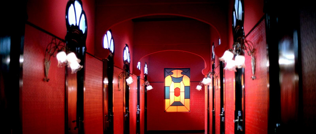
Janet Maslin has this to say in her review of the film ''Shooting on bold, very fake-looking sets, he uses bright primary colors and stark lines to create a campy, surreal atmosphere, and his distorted camera angles and crazy lighting turn out to be much more memorable than the carnage.'' (Maslin, 1977). The fake-looking sets and bold uses of colour create a dreamlike stage for the film, these techniques work completely against any form of realism and can quite easily alienate the viewer. The academy design as a whole seems to constantly hint that this isn't real and that it is perhaps some kind of bizarre fever dream, with its bright reds and sickening yellows that are almost too much to look at (See Fig 3). They are quite distracting and can easily divert your attention away from any slow or dull moments in the film.

Fig 3. Hallway Still

Overall, the design of the film in the sets and music are generally much more eye-catching than the story itself, which is exceedingly basic and doesn't draw much attention outside of its bizarre murder scenes.

Illustration List

Argento, D (1977) Figure 1. Suspiria Poster. http://images.moviepostershop.com/suspiria-movie-poster-1977-1020491580.jpg (Accessed on 09/12/14)

Argento, D (1977) Figure 2. Town Square Still. http://mygeekblasphemy.files.wordpress.com/2012/11/suspiria9_copy0.jpg (Accessed on 09/12/14)

Argento, D (1977) |Figure 3. Hallway Still. http://mannysbookofshadows.files.wordpress.com/2012/11/dormitory-hallway.jpg (Accessed on 09/12/14)

Bibliography

Gonzalez, E (2001) http://www.slantmagazine.com/film/review/suspiria (Accessed on 09/12/14)

Maslin, J (1977) http://www.nytimes.com/movie/review?res=990CEFDB1F3BE334BC4B52DFBE66838C669EDE (Accessed on 09/12/14)

Smith, A (s.d.) http://www.empireonline.com/reviews/reviewcomplete.asp?FID=132659 (Accessed on 09/12/14)


Matte Painting Development

Original Matte Painting within the Concept Art.

Maya Matte Painting.

I'm pleased with the simplicity of the image I have now, and it look promising in the Maya scene but if there's something missing I may edit it later, when the scene is more complete. The colour isn't quite right in the matte painting to blend in with the scene, but that is something I will tackle when I light up the scene. I also may need to change the colour of the buildings in the painting as it should probably fade much more into the sky.

 
Maya Scene with Matte Painting

WIM - Final Scene Constructed and Colour Mapped!


Worked on some quick lighting tests with Jordan with my lamp post. Using the 'barn doors' setting to shape the light in the second image.

Default Light.

Simple Directional Light into the scene.
My final scene is colour mapped and constructed, now onto the matte painting.
Feedback Welcome!

Sunday 7 December 2014

Film Review - The Shining (Stanley Kubrick, 1980)


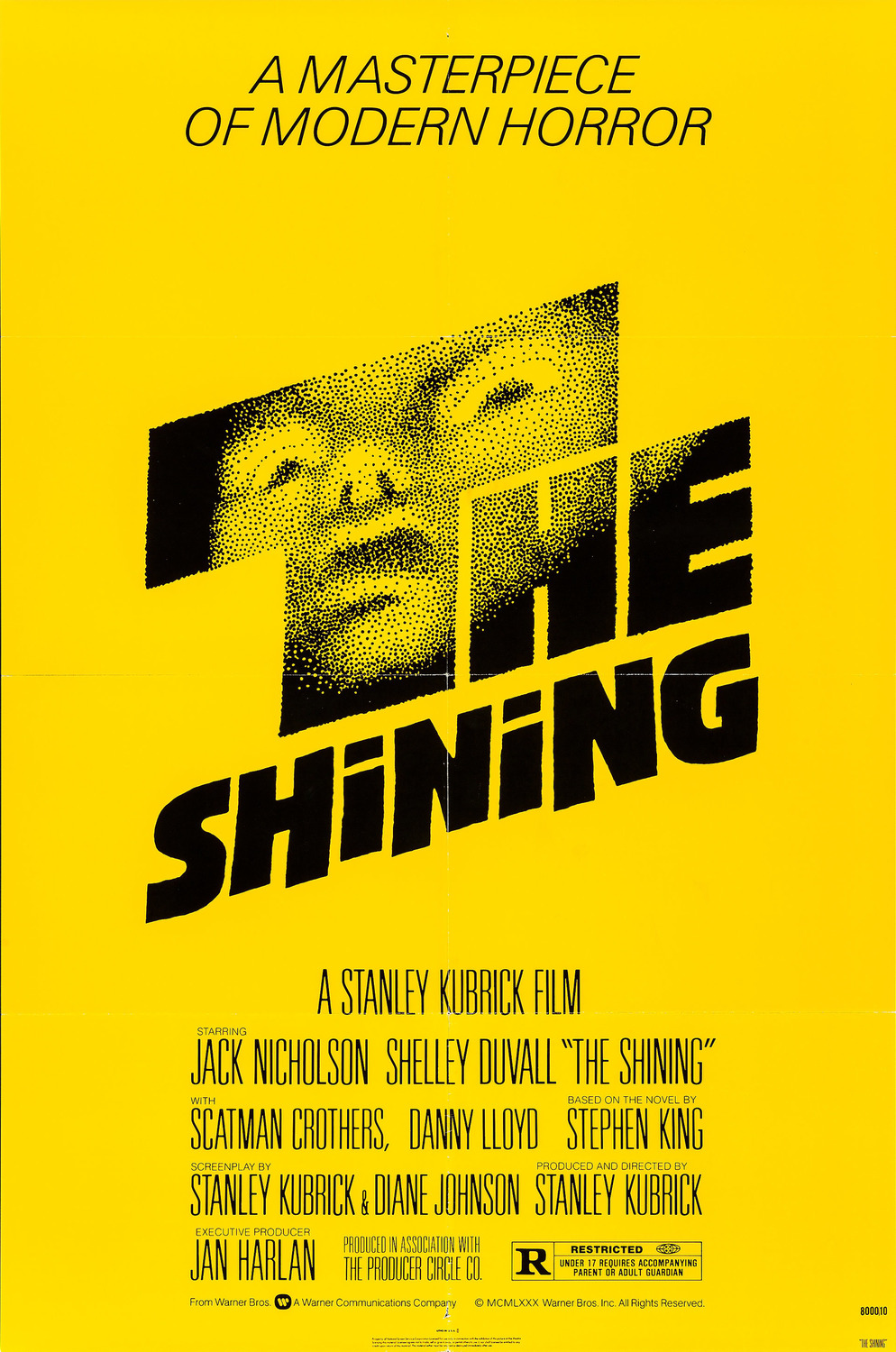
Fig 1. The Shining Poster.

The Shining, a film that shows a family of three travel high into the mountains to be caretakers at the 'Overlook Hotel' during their winter season. One of the early scenes shows the family in their car, driving up the winding, precarious mountainside road to the hotel. This sequence is accompanied by loud eerie music that gives the audience a sense that this is the beginning of something sinister.

The Shining was a film never seen before, it brought something completely new to the horror genre. Ian Nathan states ''Kubrick, akin to his trippy treatment of the sci-fi genre, was elevating horror to a different plane, removing its camp wiggeries and bogeymen to infuriate and bedazzle with sinewy suggestion and sumptuous, awe-inspiring technique. Technically, there is no better film in the genre. Its chills are less direct'' (Nathan, s.d.). Instead of the usual mix of gore and cheap scares in previous films, The Shining used a chilling soundtrack and meticulous design in all aspects of the film to create something truly thrilling. It creates a slow, constant build-up of tension that half the time leads to silence instead of a visual climax to shock the viewer. This confuses them and leaves them hanging on to the tension that is left, waiting anxiously for the scare they were expecting. Part of the films success is certainly due to the fact that when it was released, it was a fresh idea on how horror should be defined.

For the most part, the film plays out as if all of the horror could simply be Jack's visions and hallucinations. It is not until near the end of the film, when his wife Wendy sees some visions herself that it becomes harder for that to be the case. With regards to the characters, Roger Ebert has this to say ''Jack sits at a typewriter in the great hall, pounding relentlessly at his typewriter, while Wendy and Danny put together a version of everyday life that includes breakfast cereal, toys and a lot of TV. There is no sense that the three function together as a loving family.'' (Ebert, 2006). There is a very obvious distance between the family, even on car journey over to the hotel. The enormity of the spaces in the hotel emphasises their serious family issues. Throughout the film the majority of scenes show either one of them, or the occasional meeting between two. They are rarely seen in the same shot together after the car journey and even when they do, there is usually some distress or violence being shown. Jack's character in particular is the most peculiar, he is always shown as either mildly depressed, uncomfortably cheerful or is having some sort of mental breakdown. This makes him seem like he was already losing his mind before he went there and that the isolation simply pushed him over the edge.

Fig 2. Tricycle Still.

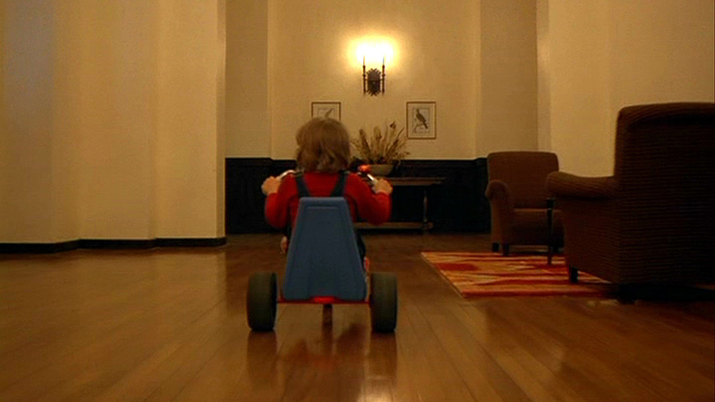
''There's pure inspiration simply in the scene in which young Danny (Danny Lloyd) rides his tricycle around the endless corridors, the wheels thundering on the wooden floor, then suddenly quiet over the carpets.'' (Bradshaw, 2012). This extract from Peter Bradshaw's review of the film shows an excellent example of the incredible sound scape of the film. The repetitive change in sound from dull wooden floors to the soft carpets makes the simple scene quite uncomfortable. The low-angle shot used is just behind the tricycle and as such the viewer is constantly seeing the floor, because of this they are aware of the next change in sound as the carpets and floor zoom towards the camera almost without end (see fig 2). You can be lulled into a strangely irritable boredom when watching this scene, it feels tense and you cannot look away as each corner is turned and a new hallway looms ahead. The Shining is a unique experience and cannot be faulted in its design, everything feels like it both belongs and has significant importance.

Illustration List

Kubrick, S (1980) Figure 1. The Shining Poster. http://www.impawards.com/1980/posters/shining_ver1_xlg.jpg (Accessed on 27/11/14)

Kubrick, S (1980) Figure 2. Tricycle Still. http://thelionthewitchandthewardrobemalfunctioned.files.wordpress.com/2012/09/the-shining-the-shining-25460753-1024-576.jpg (Accessed on 07/12/14)

Bibliography

Nathan, I (s.d.) http://www.empireonline.com/reviews/reviewcomplete.asp?FID=132700 (Accessed on 07/12/14)

Ebert, R (2006) http://www.rogerebert.com/reviews/great-movie-the-shining-1980 (Accessed on 07/12/14)

Bradshaw, P (2012) http://www.theguardian.com/film/2012/nov/01/the-shining-review (Accessed on 07/12/14)

Friday 5 December 2014

WIM - Building UV's Complete


I may tweak the model of this building, I feel that even with texturing it may look very plain and it also may not fit with the other buildings. 


I feel like I am actually starting to get the hang of UV'ing now, now that it is complete I can move towards finally texturing these.

Quick Blinn texture Test


Before I start to properly texture my buildings, I wanted to see that my dome would work in a similar way to the concept art. I'm happy with the outcome here, the colours and intensities will obviously need tweaking but this was just a quick test anyway.

WIM Maya Porgress - Dome and tunnel UV'ed


Thursday 4 December 2014

Maya Tutorial - Render Layers 2 - Depth of Field

Maya Render
Photoshop Render
After Effects Render
Final Pass Render
 
Really interesting tutorial, might use this on my scene. I will have to experiment with it once my scene is complete.

Wednesday 3 December 2014

Maya Tutorial - Render Layers 1 - Software Rendering

After Effects Render

Photoshop Render

WIM - City progress


Modeling is going well so far, but sorting out UV mapping is causing some issues. Haven't quite got the hang of it yet. Next to do though is to start some test texturing and then finish my UV's and construct the entire scene.
Side Note: these quick renders aren't showing the smoothed model, forgot how to change that for rendering.